Here you can see the development of the headline. It started out pretty basic and later on I have added more en more. I haven’t decided yet, which one of the last to that should be my final headline – what do you think?


Here you can see the development of the headline. It started out pretty basic and later on I have added more en more. I haven’t decided yet, which one of the last to that should be my final headline – what do you think?

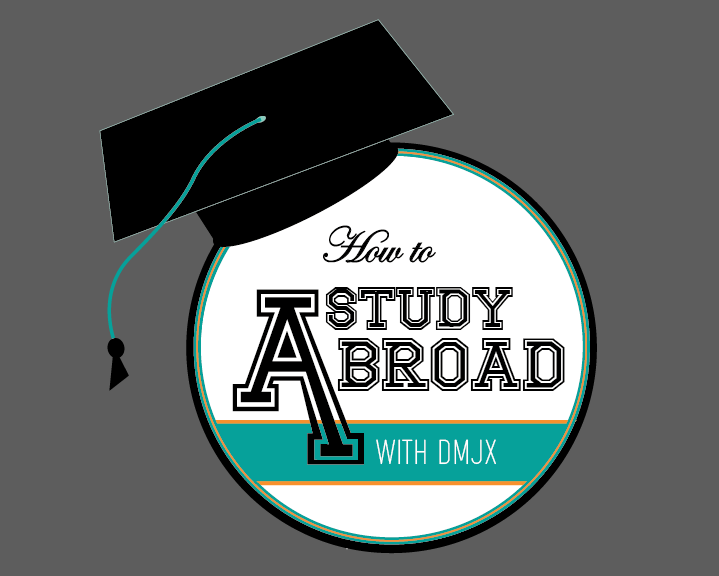
I love the 6th one, I think having the graduation cap really ties in the idea of education and studying and the plane in the ‘A’ really ties in the idea over studying overseas. maybe you could add a little bit of orange in the string of the graduation cap to reflect on the orange in the circle that the text is in. Keep up the good work.
LikeLike
My favourite is the 2nd to last one, I love the graduation cap! These are all so cool, the colours and fonts work really well together! I think the plane perhaps needs to be a bit clearer somehow though as I did not notice it straight away, I think because of the overlapping edges with the ‘A’. This is looking so good and I can’t wait to see it finished!
LikeLike
Wow! The development of your headline is looking so great! Your images created are clean and look very professional. The icon used on the plane and the graduation cap symbolise your chosen theme well. My favourite concept is #6. The incorporation of the graduation cap adds interest and the typography in encased in the circle works well and is the easiest to read. The font used is nice and bold and easier to read than concept #7. The cut out of the plane used in the letter ‘A’ is also effective – although i would just suggest moving it up a just a few mm just in be in the place where there is a gap in the letter A. Your colour pallete is nice and neutral and suits your idea with a good pop of gold. Overall, amazing progress!
LikeLike
[…] https://idamariewonsild.wordpress.com/2015/06/01/wip-the-headline/comment-page-1/#comment-7 […]
LikeLike
Hey, nice work! I really like your 6th one because I think that the graduation cap and the plane in the ‘A’ really fits with the theme of education and studying abroad. I think that font works really well too. The only thing I could suggest would be playing around with different fonts and adjusting the ‘A’ (by this I mean seeing what it looks all leveled). I also think the orange goes really well, so it could be nice to incorporate the orange somewhere else in the image such as the graduation string. Goodluck! I’m sure whatever you decide will look great! 🙂
LikeLike
[…] https://idamariewonsild.wordpress.com/2015/06/01/wip-the-headline/comment-page-1/#comment-10 […]
LikeLike